UX Case Study - Landing Page
Hi there, in this UI/UX Case Study I’ll be sharing my thought process and design thinking in redesigning the landing page of a revolutionary property-tech website. The goal of this redesign was to increase visitors' confidence and trust in the website.


Why I chose to redesign Cribstock Landing page
I discovered Cribstock through a YouTuber and was drawn to their mission of making real estate investment accessible. However, their landing page didn’t inspire trust or credibility. After researching user feedback on Twitter, I found others shared similar concerns; confirming the need for a redesign that builds confidence and clearly communicates value.
BACKGROUND
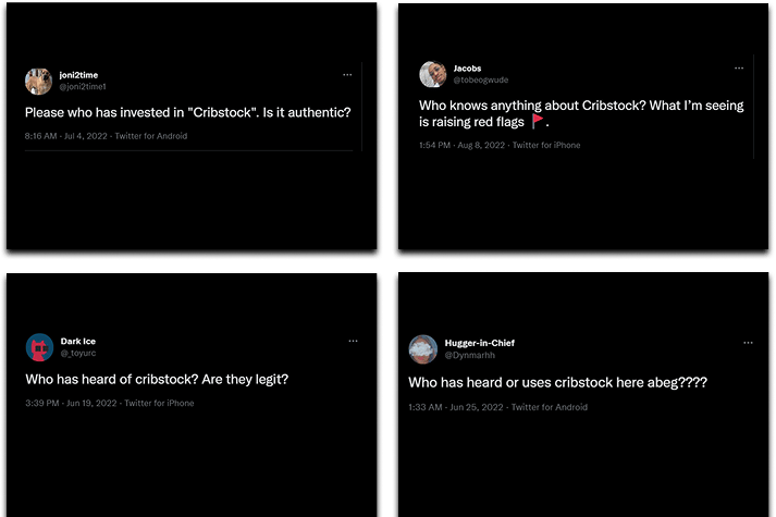
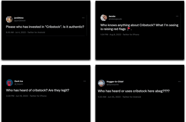
"Due to past experiences of being scammed, people are understandably cautious when it comes to investing in real estate and prefer to proceed with caution."
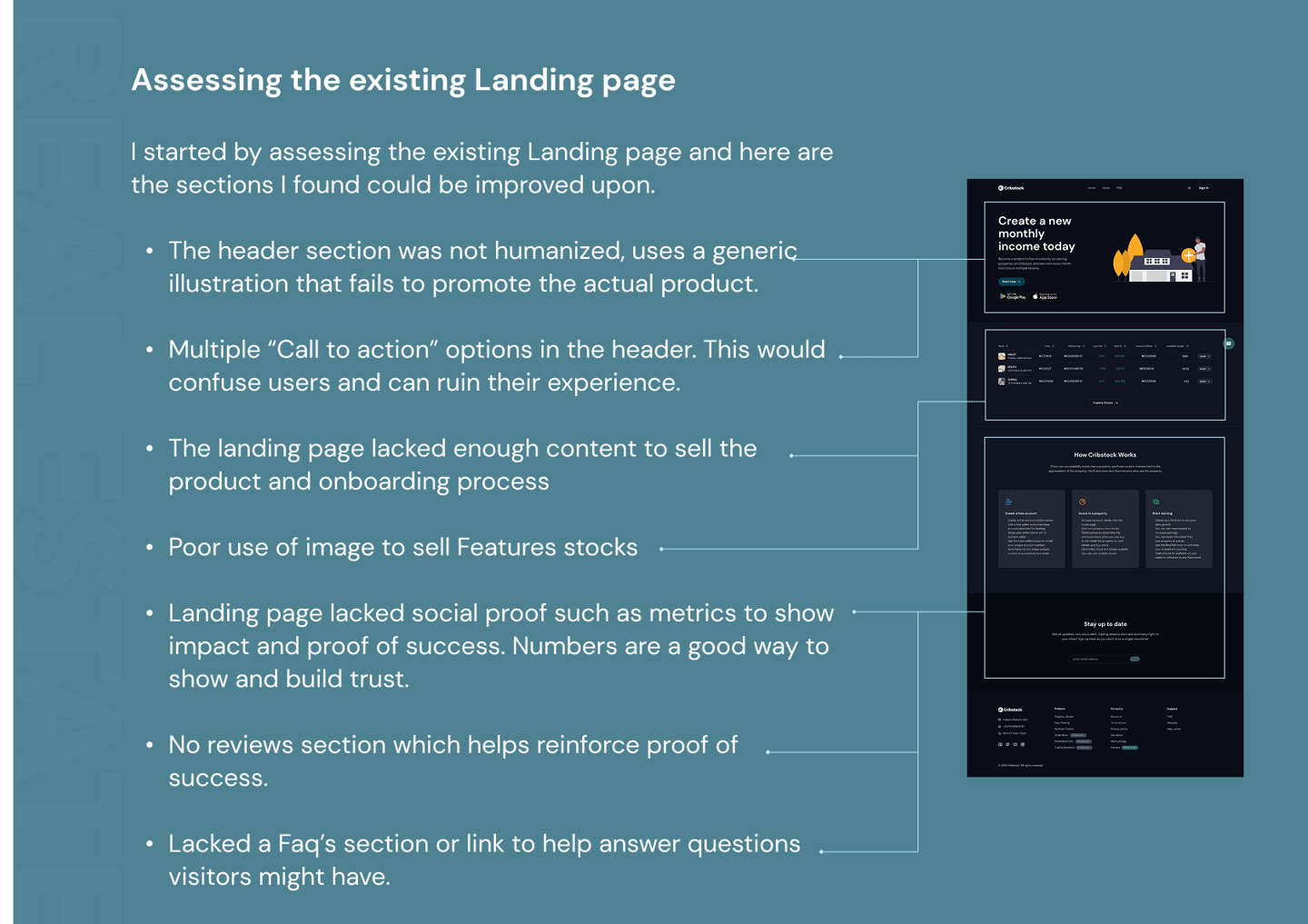
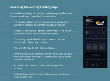
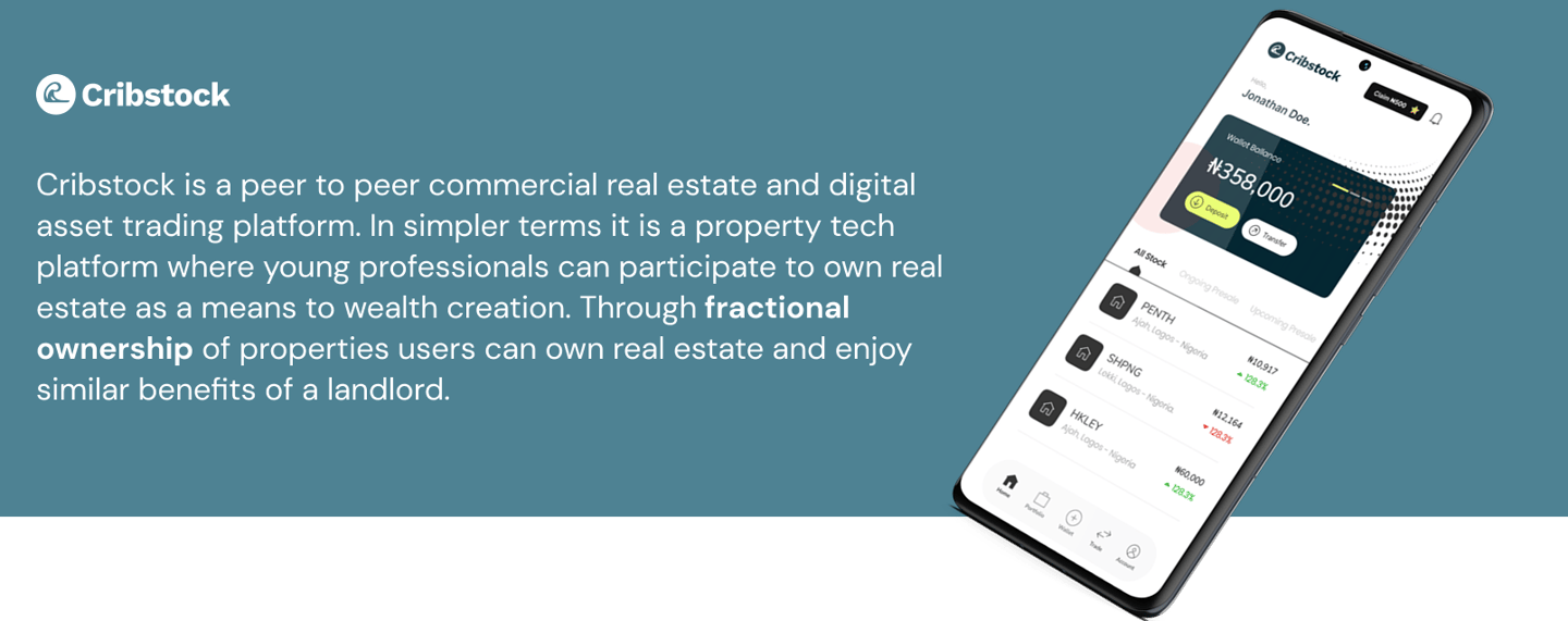
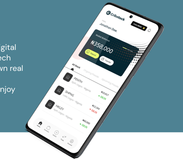
Hero Section
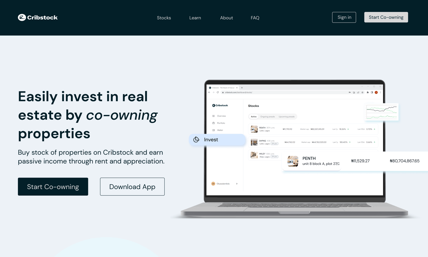
The hero section sets the tone for the rest of the site and can make a powerful first impression. This section should sell the product offering and allow users take action
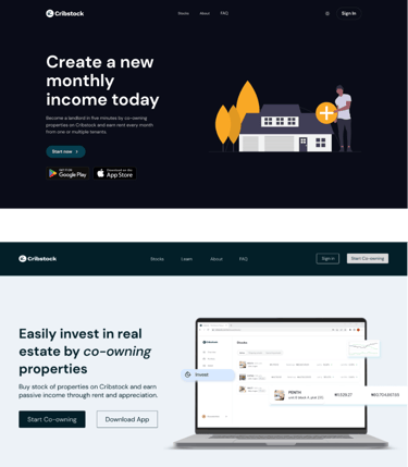
Redesigned Hero Section
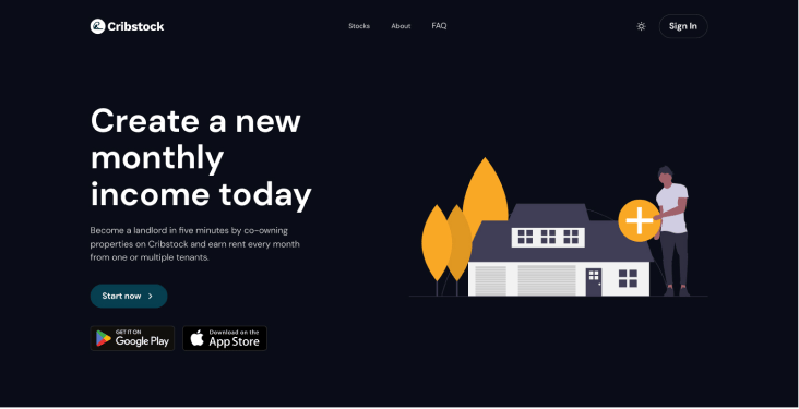
Existing Hero Section
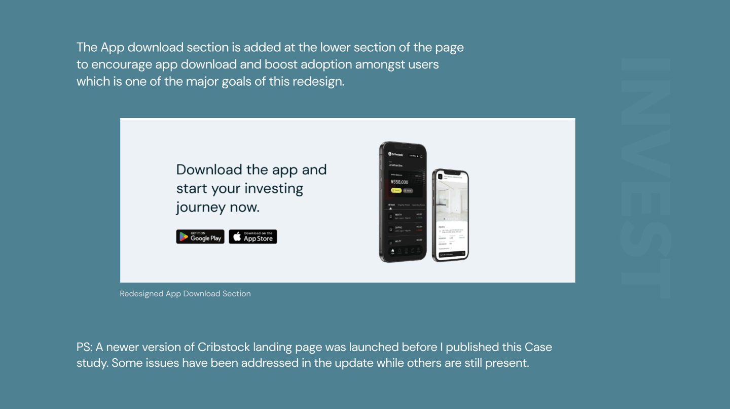
In my redesign I use this section to display the product (cribstock dashboard) on a mock-up. I also composed clearer copy for the hero section. This allows users understand that Cribstock is simply a platform to co-own properties.
I also reduce the cluster of CTA’s, then made “download app” button set as a CTA to boost app download and encourage adoption. I also incorporated a sticky menu bar for easy navigation through the web page.
Establishing Reputation and Proposing Value
Establishing reputation and proposing value are both critical components of website design because they play a crucial role in attracting and retaining website visitors, converting them into customers, and building a positive reputation for your brand.
In the redesign of the following sections I improve the website content structure. I use strong visuals to help humanize the website and reiterate the message.
Showing numbers is a way to establish confidence and assurance with new users.
I redesigned a features section, using a card/thumbnail to better sell the properties offered on Cribstock.
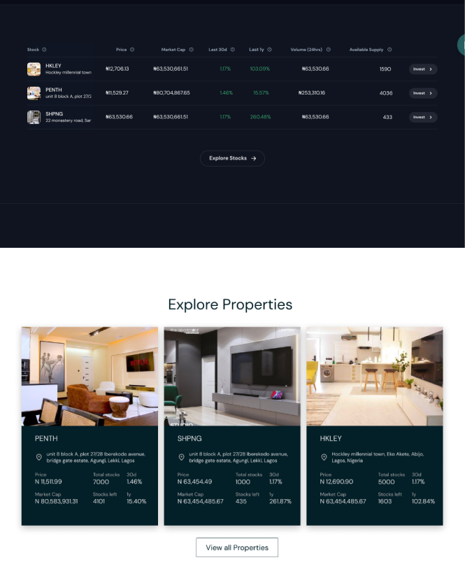
Redesigned Stocks Section
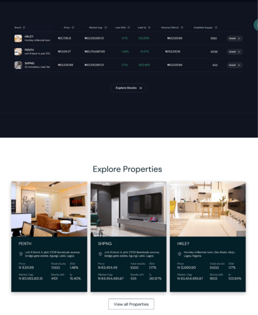
Existing Stocks Section
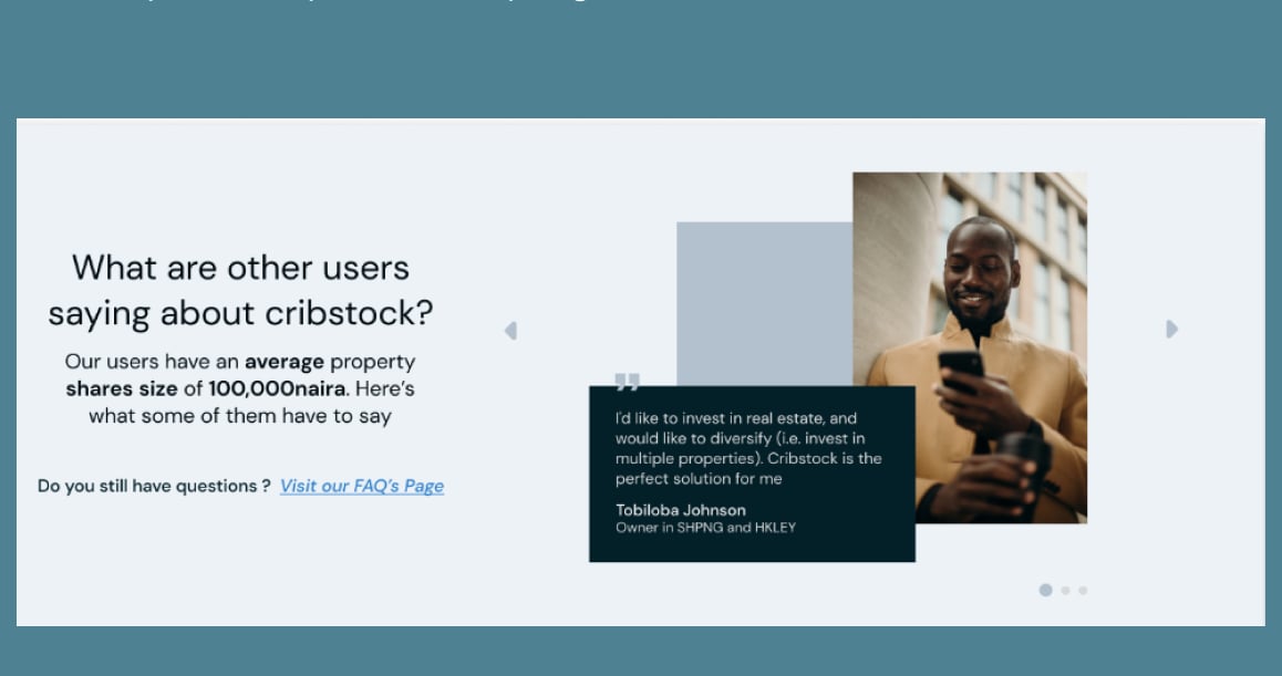
Redesigned Testimonial Section
Introducing Email Funnel
Email funnels are essential to websites because they help to build relationships with customers, increase engagement, and ultimately drive sales.
Cribstok can nurture leads by providing their users with valuable content and building a relationship with them. This section promises to provides value to the user while serving as an email funnel.