
QaceHomes - Design System
Overview
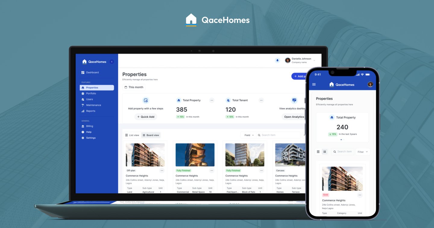
As the founding designer at QaceHomes, I led the creation of our design system to bring structure and scalability to a product that supports landlords, property managers, and agents managing hundreds of units across Nigeria.
This system ensures visual consistency, improves handoff to developers, and reduces decision fatigue across new features. From brand to interface, every element was designed with clarity, accessibility, and modularity in mind.
The Brand Foundation
QaceHomes needed a brand identity that inspired trust, while remaining clean and simple enough for digital real estate operations.
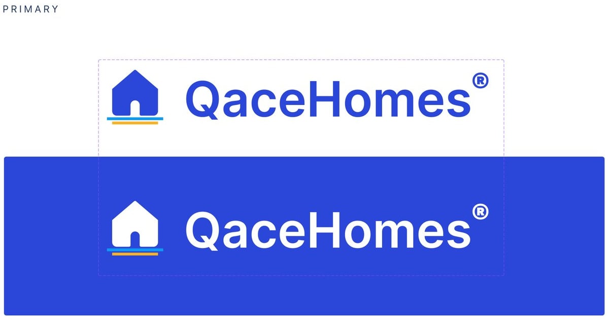
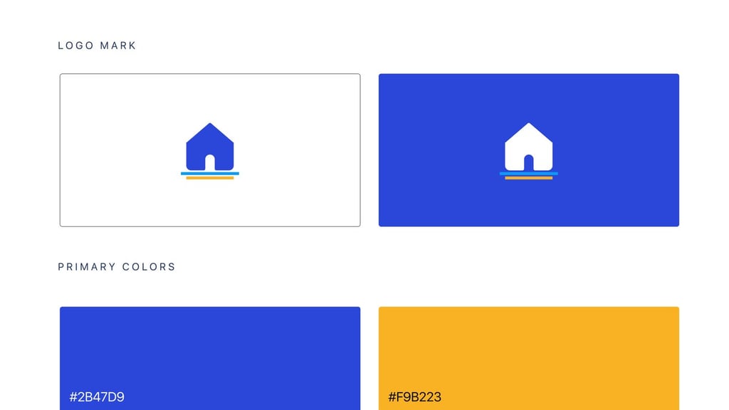
Logomark: A minimal home icon with a grounded line—a nod to security and structure
Typography: Clean, geometric sans-serif for modern readability
Primary Colors:
Blue #2B47D9 for authority and digital trust
Yellow #F9B223 as a highlight accent, used sparingly
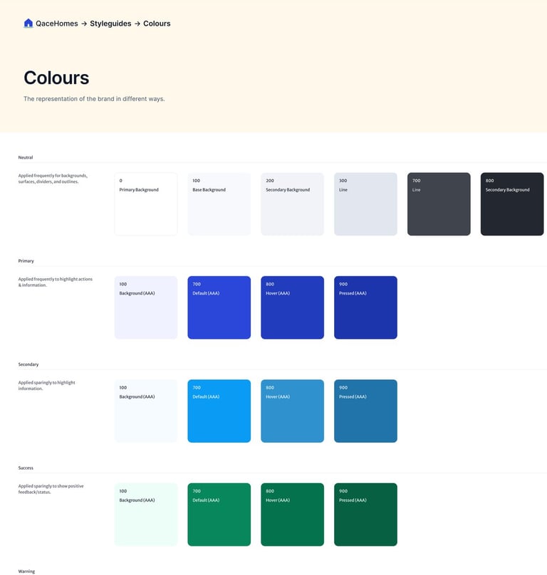
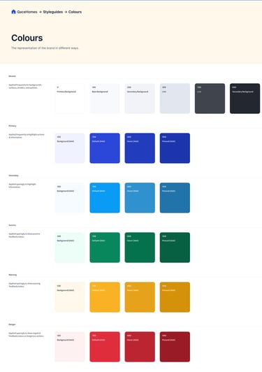
Colours & Accessibility
The color palette was crafted to ensure:
AAA/AA contrast accessibility across light and dark modes
Contextual color use (e.g., blue for actions, green for success, yellow for alerts)
System Highlights
Neutrals: Support backgrounds, dividers, surfaces
Primary: Used for CTAs and navigation
Secondary: Used to differentiate contextual features
Success, Warning, Danger: Semantic feedback colors
Text tokens: Tuned for contrast and readability
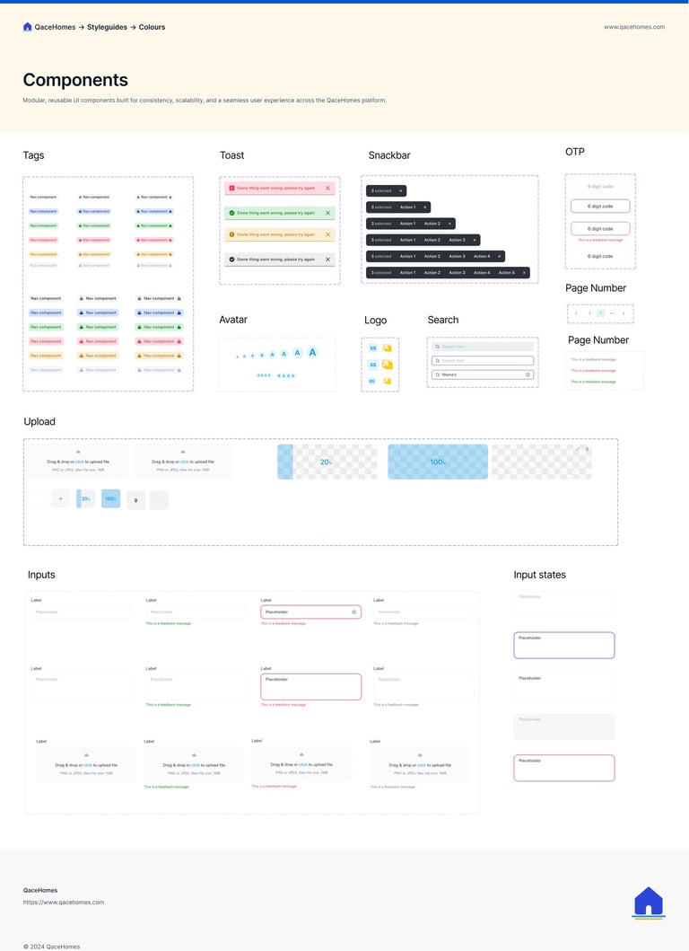
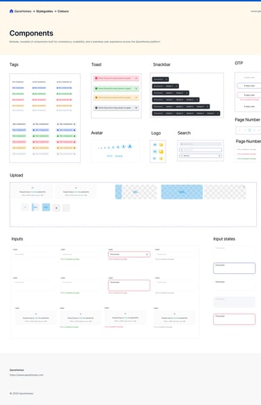
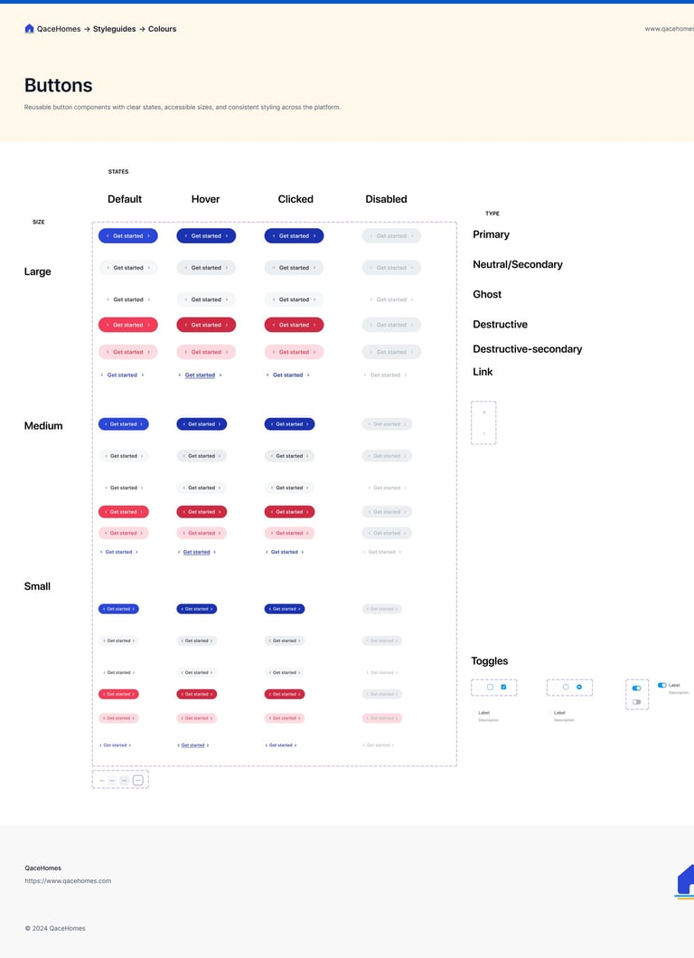
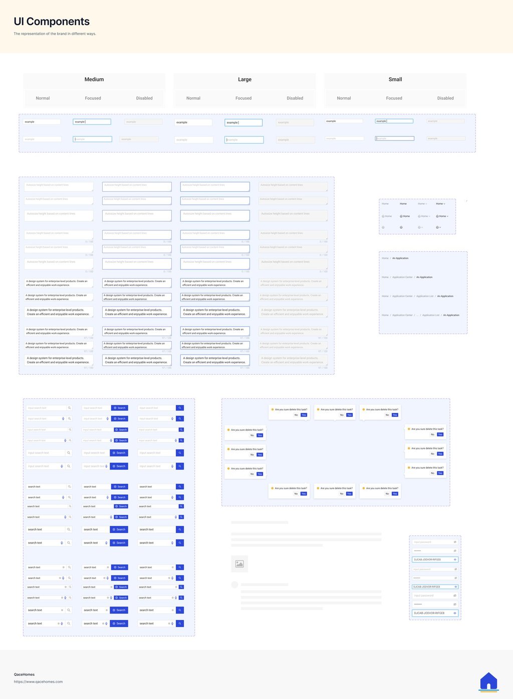
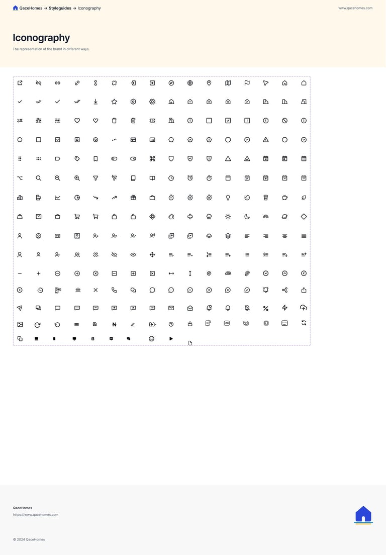
Component Types
Inputs (small, medium, large)
Dropdowns and selectors
Tabs, modals, toasts, banners
Buttons with icon support
Status chips and badges (e.g., "Vacant", "Occupied", "Pending")
UI Componests
I designed modular components that support responsiveness, states (normal, hover, pressed, disabled), and scalable use cases.
Focus Areas
Clarity: Field labels, helper texts, and placeholder logic
Consistency: Reuse of spacing, typography, and elevation
Scalability: Built in Figma as variants for dev-ready tokens
Goal
Reduce design-developer friction
Support multiple roles (Landlords, PMCs, Agents)
Enable faster feature rollout
Outcome
Custom role-based cards, views, and access badges
New features use existing blocks with minimal overhead
System Goals
Ensure accessibility
WCAG 2.1 tested - AAA contrast where needed
Created tokenized naming + component documentation
Implementation & Handoff
Built with Figma Variants and Auto Layout 5.0
Created a shared team library for scalable reuse
Maintained versioning using design documentation in Google Doc
Regularly synced with frontend devs to translate components into code (React + Tailwind)
Reflection
Designing this system from scratch helped us move faster, speak the same visual language acreoss teams, and stay consistent as QaceHomes evolves. It's a living system-modular enough to support a future mobile app and robust enough for any new feature we ship.
Next Steps
Expand dark mode support
Add motion specs (micro-interactions)
Introduce token-based theming for white-label partners
Build mobile variants for upcoming apps